hillaryclinton.com
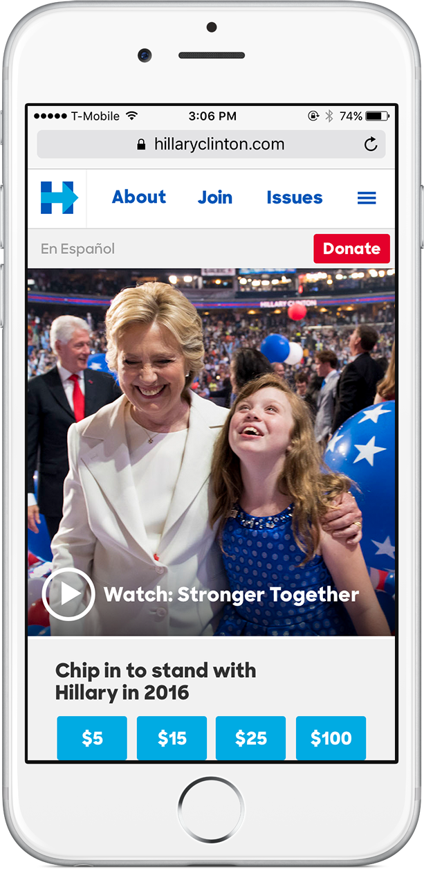
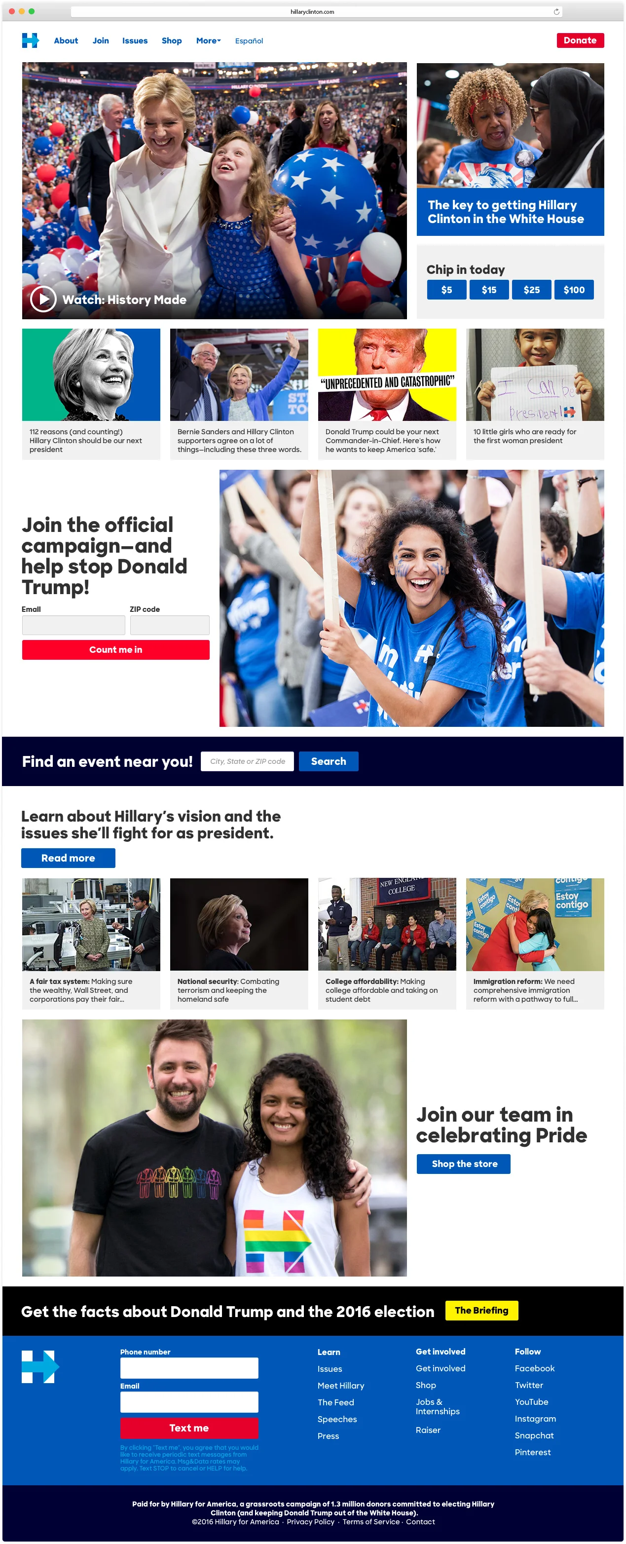
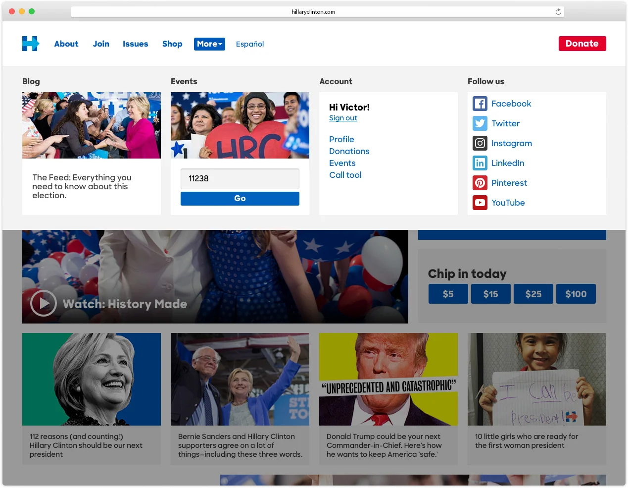
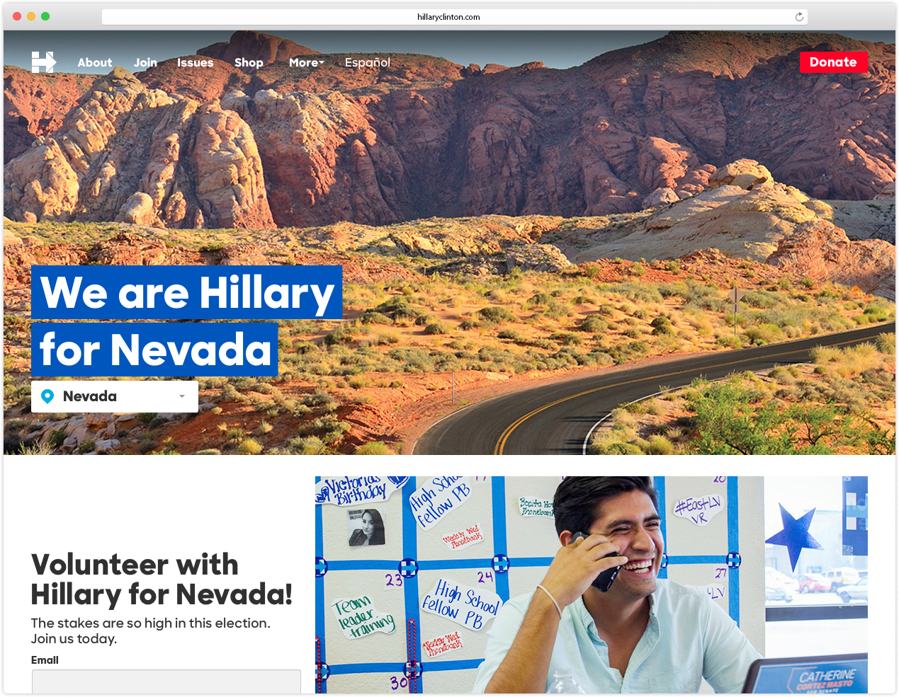
In the years since the 2012 presidential race, internet users had increasingly come to expect native content and video built for mobile browsing. With the 2016 refresh of hillaryclinton.com, we optimized the experience for high-quality content, video, and an opinionated navigation. A modular design allowed for fast optimization for fundraising, volunteering, and rapid response content. The website became less of a singular destination and more of a hub to house content directed from all platforms.
By nature, every campaign tech team is more advanced than the one that came before it. We were in awe of and thrilled to collaborate with our better-faster-stronger engineers. Our tech designers focused on the visual integrity of our digital products and pushed storytelling to its max.
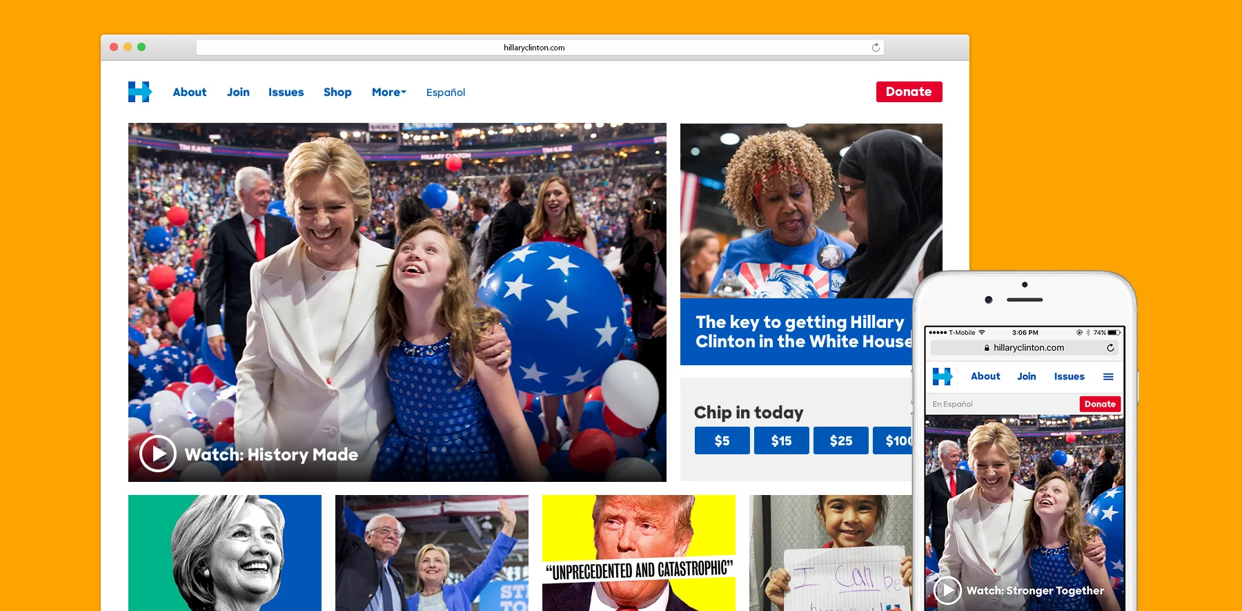
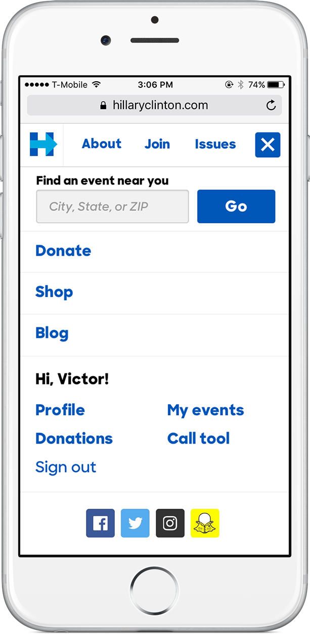
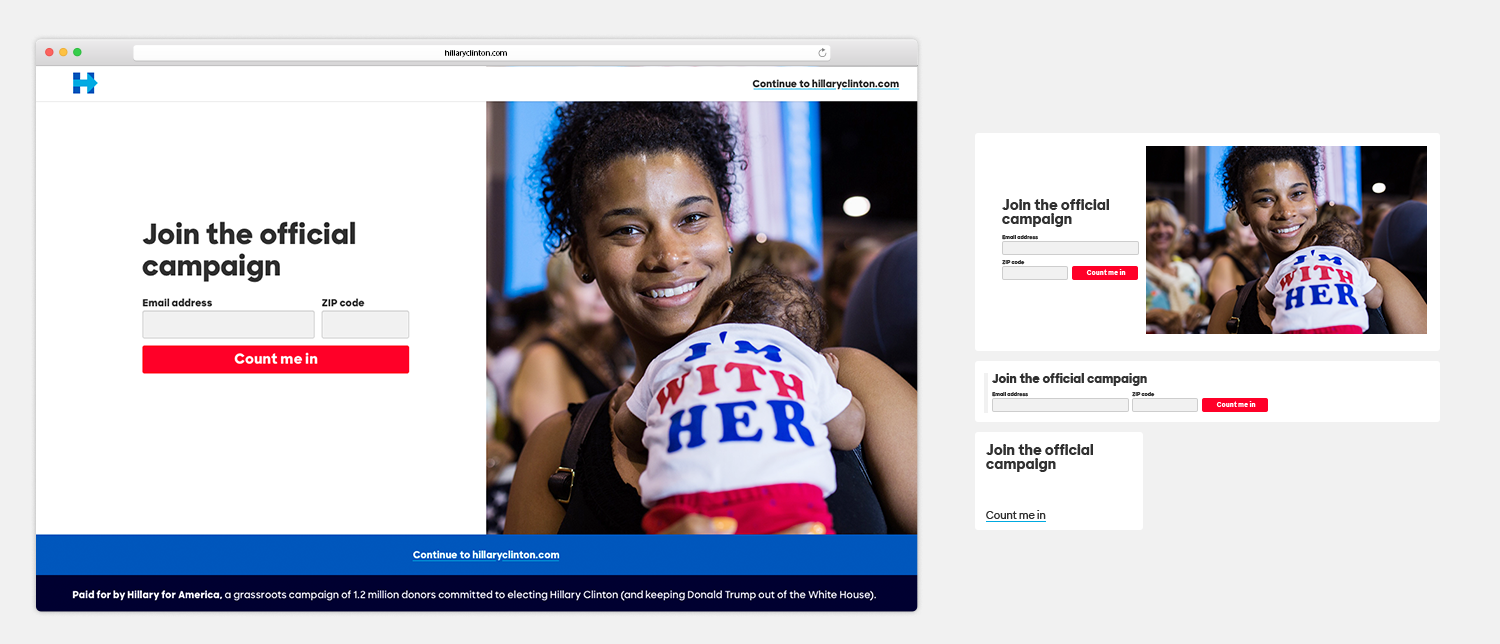
Made for mobile
Images were optimized for performance and built for shareability—and responsive layouts made the transition between different mobile platforms like Facebook and Twitter seamless.
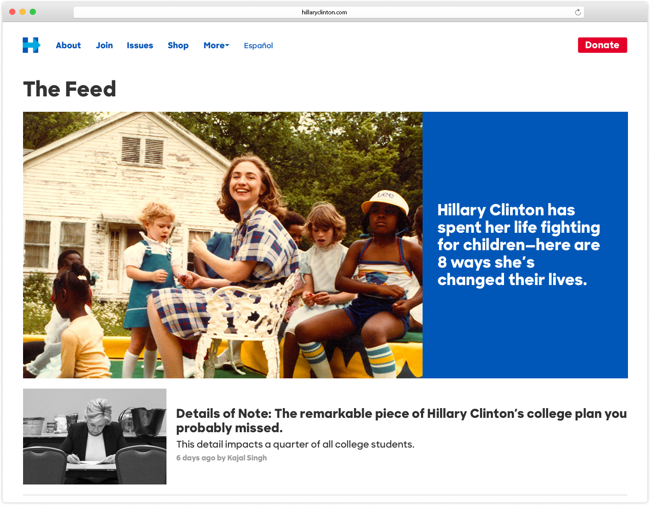
An immersive, visual, and useful product
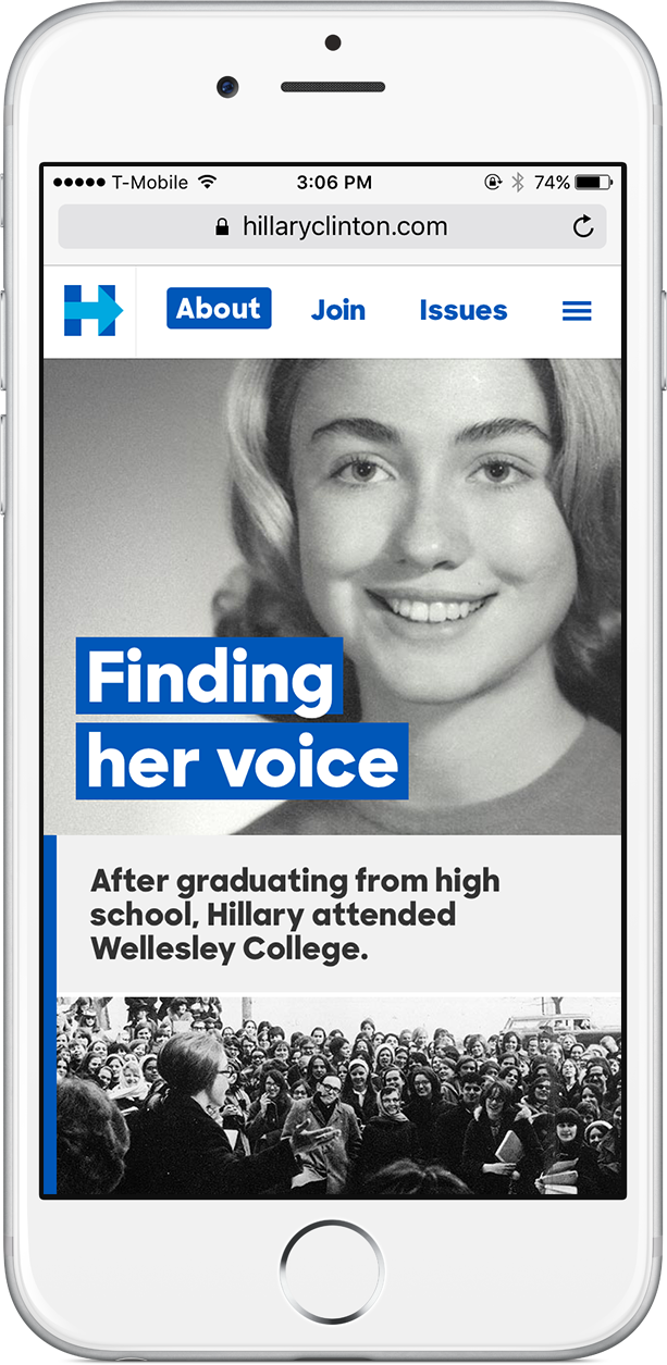
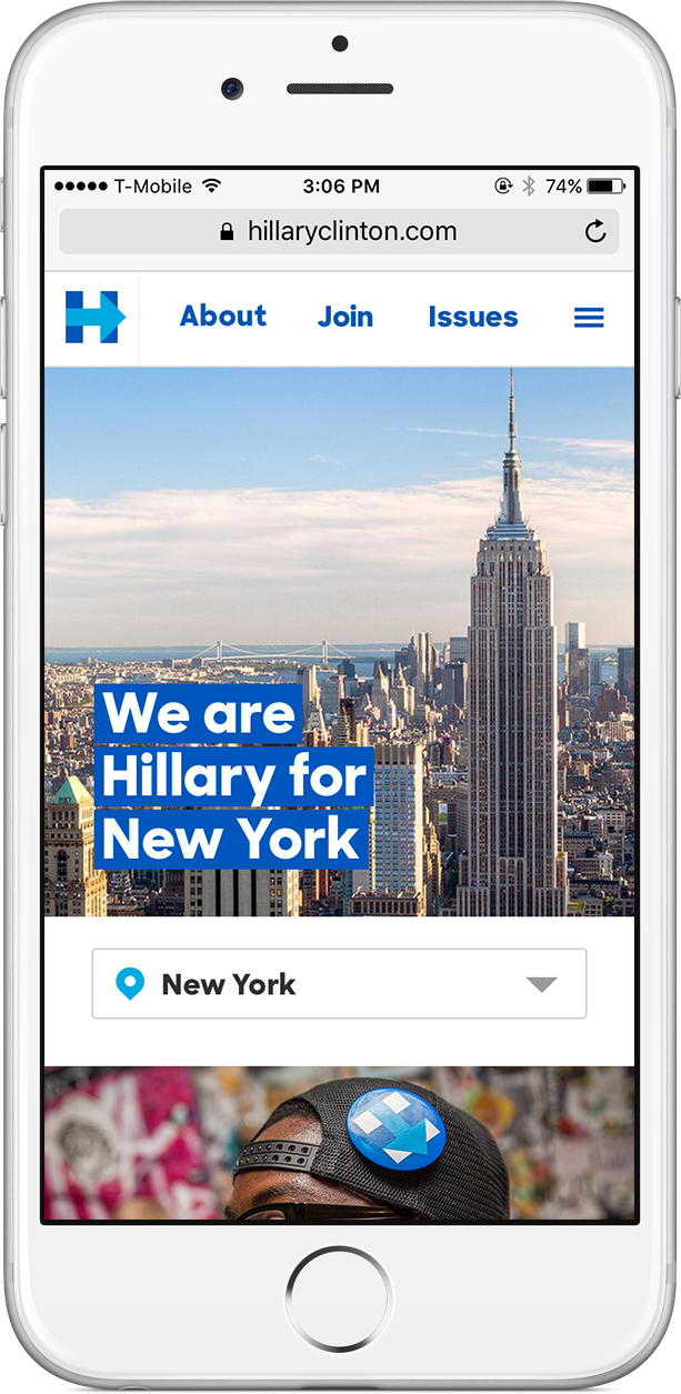
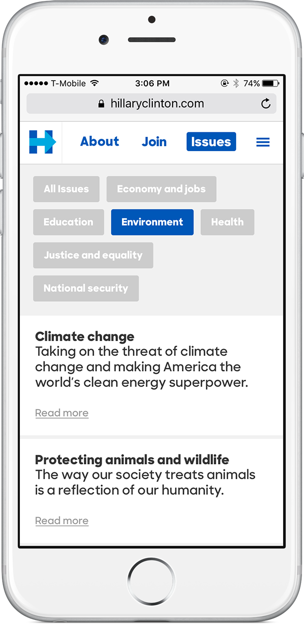
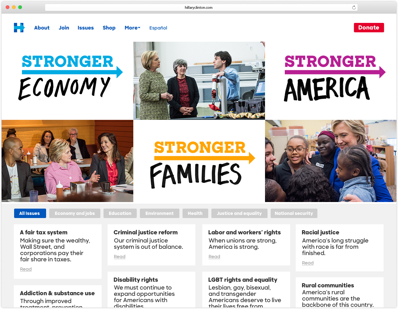
We teamed up with writers, photographers, and videographers on the campaign to build a website that celebrated our supporters, showcased emotional and personal stories, responded to the news cycle in real time, and broke down wonky policy proposals. Throughout the campaign, the goal was to keep the site fresh, relevant to the issues of the day, and flush with any information that supporters might need.
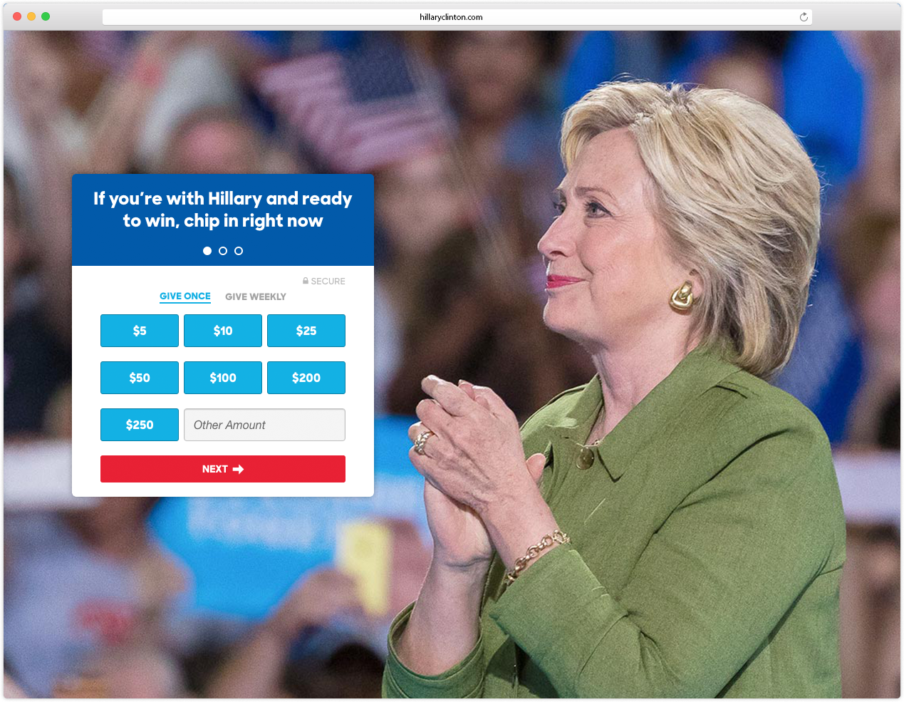

Flexible and contextual actions
To allow for rapid testing of content, we built a highly flexible system for actions. A call-to-action was embedded in a range of places throughout the site and optimized contextually.
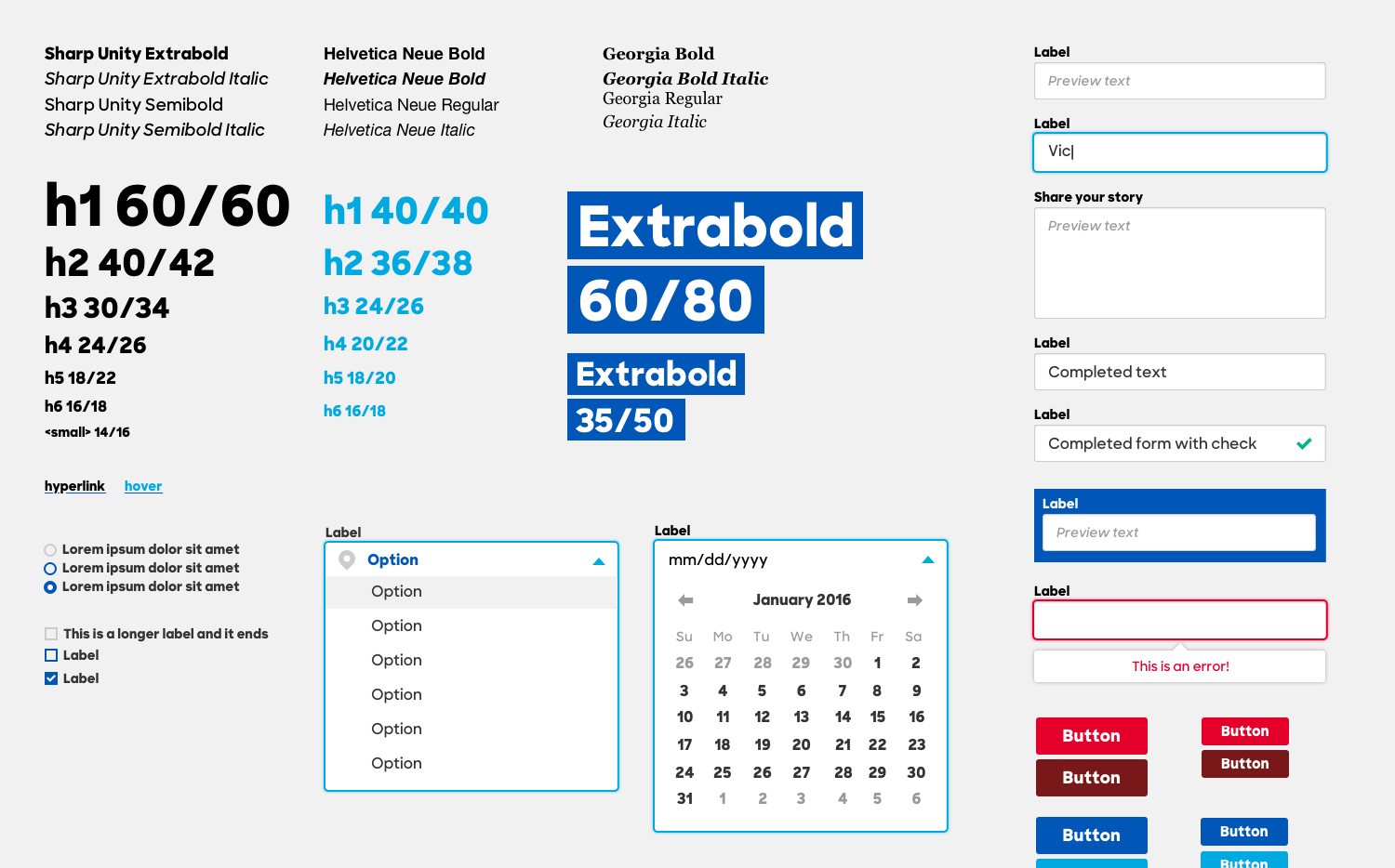
Accessible and re-usable components
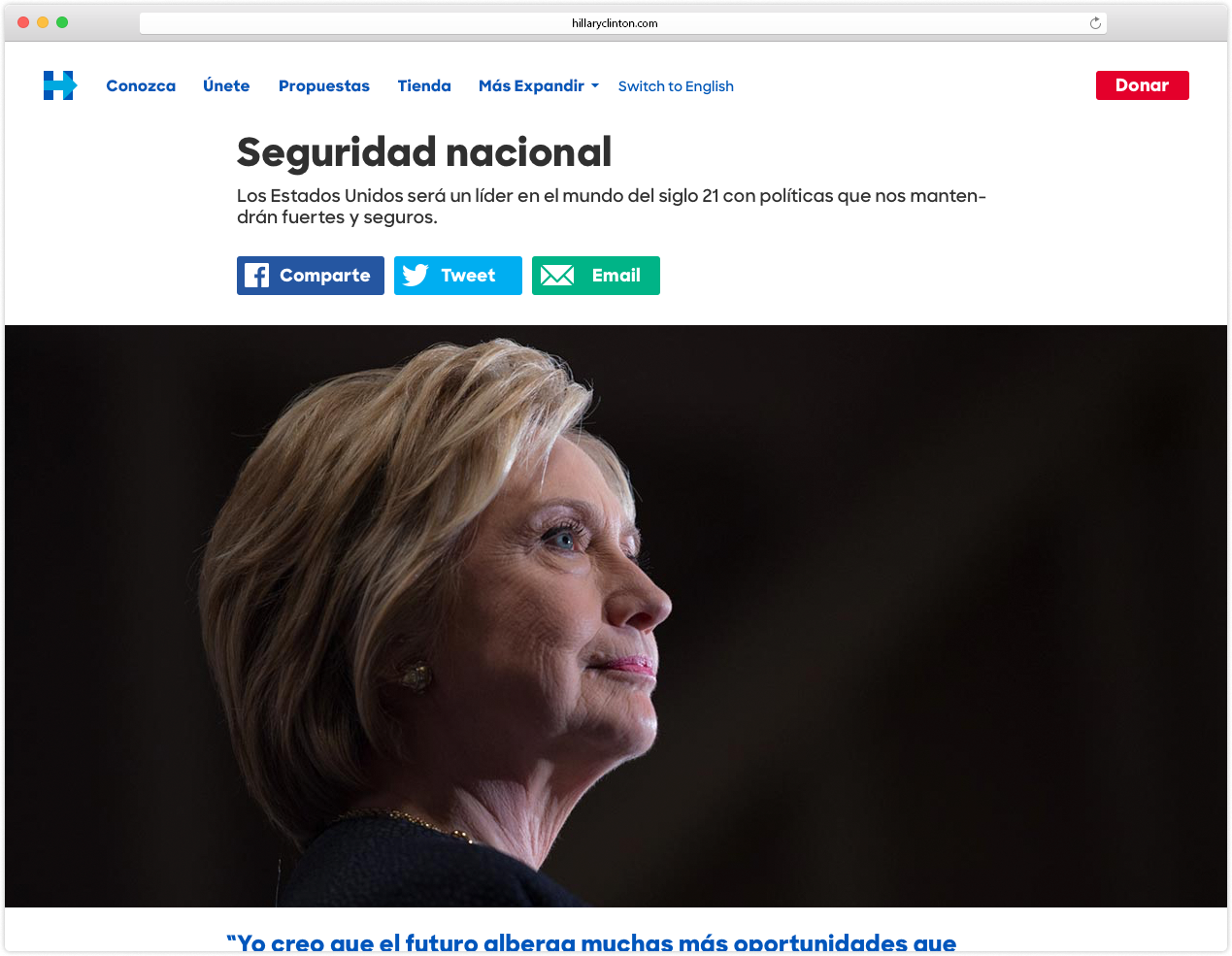
An important tool for our rapid iteration was a library of standardized components. Taking a cue from our candidate, we designed a system that was accessible, bilingual, and adhered to the Web Content Accessibility Guidelines. This included choosing colors and sizes that offered appropriate contrast for people with low vision, providing keyboard-only page navigation, and tagging content for accurate screen reading.
Collaborators
Team Content
Team Photo
Team Tech
Press
Lullabot, Making web accessibility great again: auditing the US Presidential candidates websites for accessibility
Web Design Ledger, A few things web designers can learn from Hillary Clinton